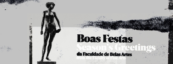
Porto Faculty of Fine Arts (FBAUP), 2017 season’s greetings (Facebook page banner)
In the last months (since summer, actually) we’ve been involved in a series of projects. A couple of commissions and a few experiments. As a result, we still haven’t printed our new year greetings card… (it’s in the works, it will be done soon!)
In the meanwhile, we’ve had the chance to try, experiment, and learn a few things with other works. The FBAUP’s greetings card was one of them.
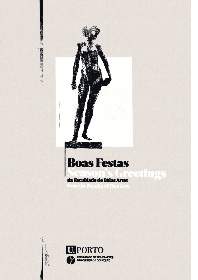
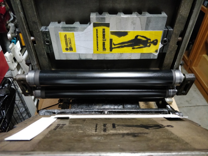
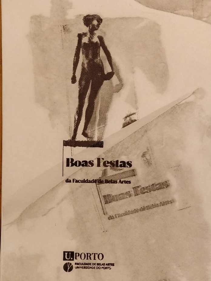
Commissioned by the faculty director, we opted to illustrate one of the most prominent sculptures in the school grounds from José Rodrigues. After trying to do a line drawing, we opted to use an engraving instead. In the process, we built a small UV exposure unit to develop our own photopolymer plates. This worked out surprisingly well — we were able to print the first proofs and get it approved. In the end, because pressure was an issue with detail, and because we wanted more of a deep impression in the paper, we ended using a zinc plate for the figure. We recurred to Almeida Gravador, a house specialized in engraving near the school that dealt with the process with amazing speed and precision (all done through email and phone!).

DSType Breve Display typeface
The text was set in the polymer. We opted by renting one of Dino dos Santos’ typefaces from Fontstand—Breve News bold & Breve Display. I was quite happy with the type choice. Fontstand proved to be a crucial instrument to this process.
This allowed us to design and create the first (digital) composite versions for email and for social media.
Digital animated version for email
After the initial planning and budget approval to print this with black and white inks on GMund Heidi Faded Grey 530g/m2 paper stock, someone messed up at the central office and the order didn’t came through — who knew that to make a couple of clicks to buy something online could take more than two weeks?
So, although it didn’t work very well, we recurred to the available paper stock near us and ended using a light gray and black on 330g/m2 Invercote paper. I like the result, but I was kind of sorry not to have used a better choice paper stock. Maybe now I would have opted for a 100% cotton Conqueror Connoisseur… but the lack of structure in the paper (it folds easily in the final A5 format) was something that prevented us from using it. All other options would have to be ordered (online or through the supplier), and would be available on time. I’ll be better prepared next time…
In the end, for better or for worse, the postcard was printed (after two all-nighters in the garage printing), in a limited 160 copy, two color edition.
Here are a few images of the process and end result.
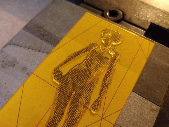
Photopolymer detail
Hand-made photolymer plate in the printer bed.
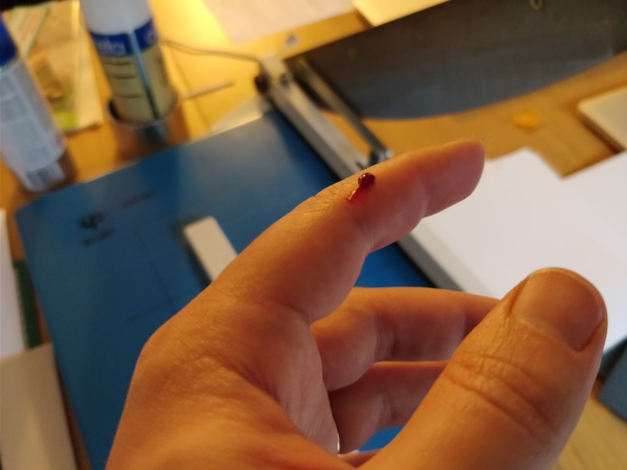
Cutting myself in the guillotine… 20 years after starting to use knives and cutters in graphic design, I still cut myself…
One of the first (dirty) test prints — we both love the dirty, accidented prints!
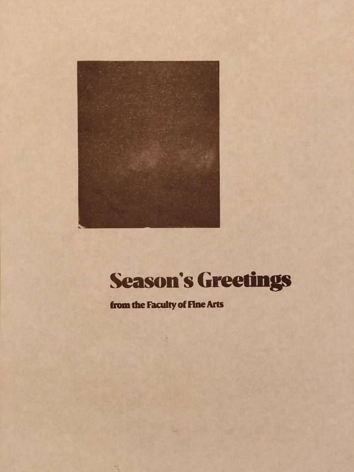
Base color test print
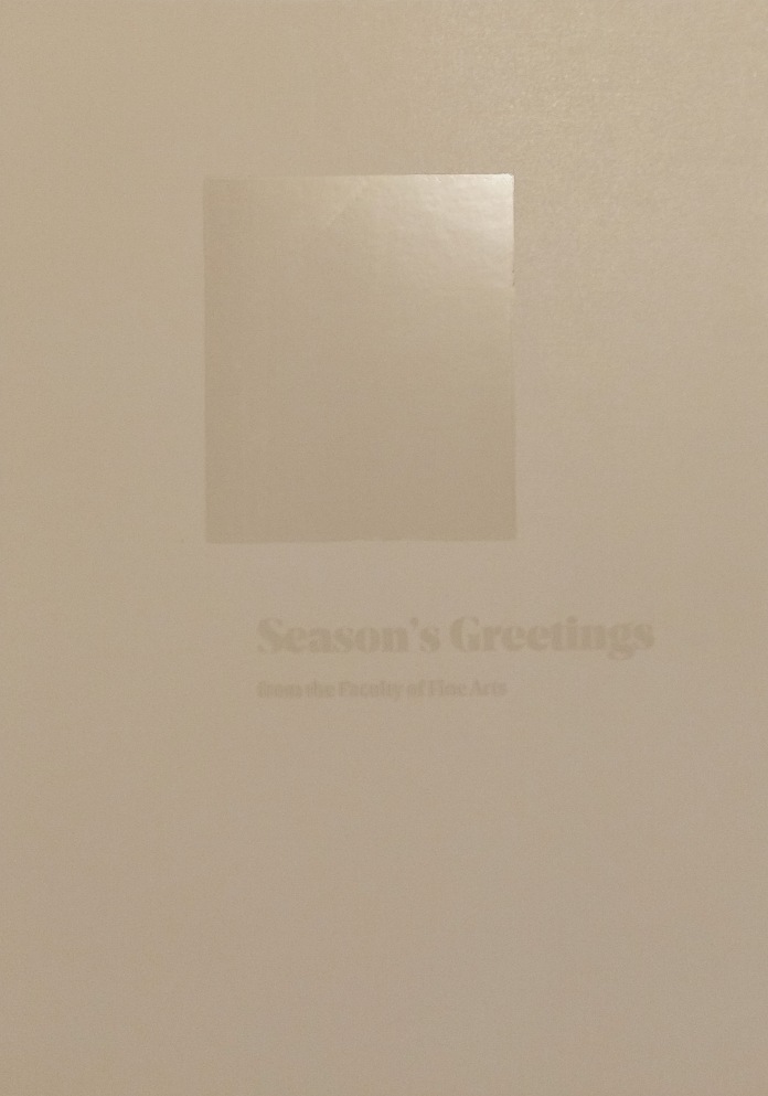
Base (final) color trial, on Invercote paper (still hadn’t got the pressure right for the polymer. You can see the letters smudging)
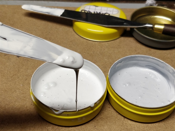
Fine-tuning the silver & opaque white ink mixture. In the end, we used an approximate 5% gray for the base color.

Professionally produce Zinc plate (Almeida Gravador) vs. hand-made Photopolymer plate (M3N Press)
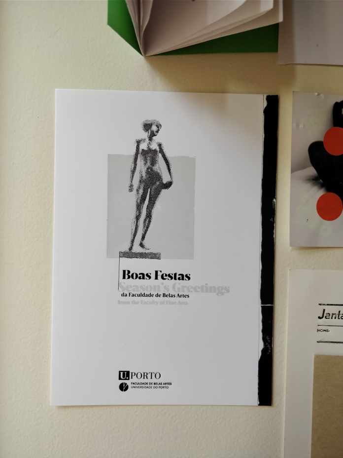
Final postcard specimen on the wall (you can see the deep impression and the lack of registry of the colors—still have to learn to get this right!)
